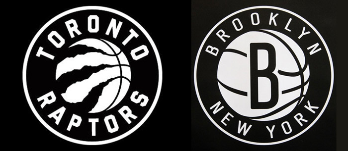
The Toronto Raptors announced their new logo for next year’s season this week. Almost immediately, the Brooklyn Nets (who eliminated the Raptors from the playoffs last season), tweeted their thoughts about the logo:
“.@Raptors Looks familiar”
Now why would they say that? Let’s take a look:

Now, granted, there’s only so many different ways you can draw a basketball… but maybe Brooklyn has a point.
What do you think? Is the Raptors’ new logo too similar, or is this a coincidence resulting form each team using a long-standing formula for circular logos? Or, is imitation the sincerest form of flattery?
Post your thoughts below!
